GPT Image 2: Complete Guide
June 3, 2026
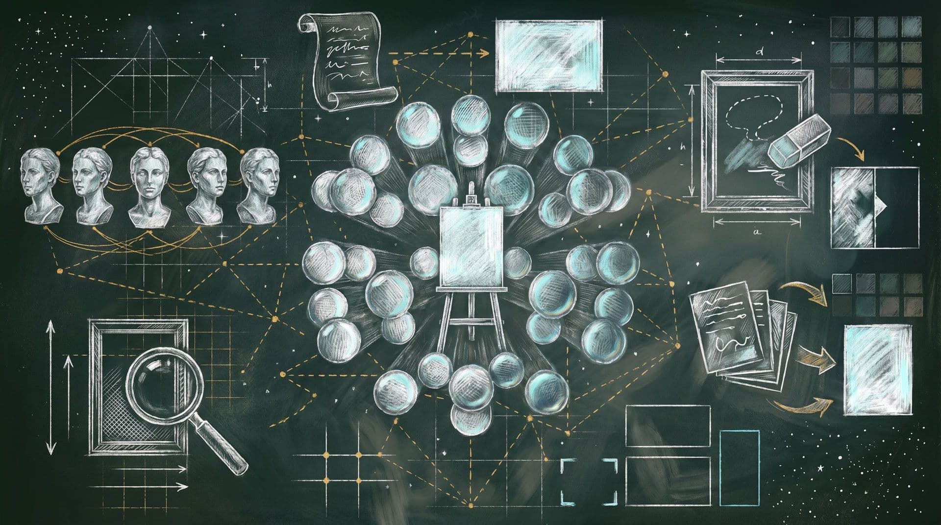
GPT Image 2: Complete Guide
WHAT IS GPT IMAGE 2?
OpenAI's second-generation image model, successor to GPT Image 1.5 (Dec 2025) and gpt-image-1 (Apr 2025). It's the first image model with ‘integrated O-series reasoning’ — it plans, researches, and reasons about the image structure *before* generating. This makes it dramatically better at complex compositions, layered prompts, and multi-element scenes compared to keyword-matching models.
Key Specs
Aspect Ratios:
3:1, 21:9, 16:9, 4:3, 3:2, 1:1, 2:3, 3:4, 9:16, 1:3
Resolution:
1K
2K (default)
4K
Quality:
low (fast)
medium (balanced)
high (best)
Output Format:
PNG (lossless)
JPEG
WebP
Max Prompt Length:
7,000 characters
References:
Up to 4 input images
Transparency:
❌ NOT supported (use GPT Image 1.5 for transparent backgrounds)
Cost Tip:
Default to 1K/medium for iteration. Only go 2K+ or high quality for final output.
CORE STRENGTHS
- Agentic Reasoning — Proactively plans image structure before drawing. Complex scenes get composed correctly on the first try.
- Text Rendering — 95%+ accuracy across Latin, CJK, Arabic, Hindi, Bengali scripts. Best-in-class for in-image typography.
- Native 2K Resolution — Double the output of GPT Image 1.5, with optional 4K upscaling.
- Multi-Reference Compositing — Up to 4 input images for style transfer, virtual try-on, character consistency.
- High-Fidelity Photorealism — Natural lighting, skin texture, material accuracy.
- World Knowledge — Can render real-world landmarks, species, cultural references accurately.
- Complex Structured Visuals — Infographics, diagrams, UI mockups, data visualizations.
KNOWN WEAKNESSES & LIMITATIONS
- ❌ No transparency support — Use GPT Image 1.5 if you need RGBA/transparent backgrounds
- ⚠️ Brand logos are hit-or-miss — Fine detail consistency on existing brand marks is unreliable
- ⚠️ Slow and resource-intensive — High quality at 4K can take 3+ minutes
- ⚠️ Expensive at high quality — Most expensive image model option in Luma
- ⚠️ Quality degrades in edit chains — Use upscale between successive edits
OPENAI'S OFFICIAL PROMPTING BEST PRACTICES
Source: OpenAI Cookbook, April 21, 2026
Prompt Structure (The Golden Order)
Background/Environment → Subject → Specific Details → Constraints
Always move from **wide context** to **narrow specifics**. This mirrors how the model's reasoning engine parses intent.
The Six Commandments (from OpenAI)
- Structure prompts consistently — background → subject → details → constraints
- Be specific about materials and textures — "brushed aluminum" not "shiny metal"
- Use explicit constraints — state what to preserve AND what to change
- Put literal text in quotes or ALL CAPS — include typography details (font, size, placement)
- Iterate with small changes — don't overload a single prompt
- Reference multi-image inputs by index — "Image 1 (description): use as [role]"
Editing Prompt Style (CRITICAL)
- Write DIRECT COMMANDS, not descriptions
- Be TERSE — "Remove background" not "Please remove the background from this image"
- State WHAT TO CHANGE and WHAT TO KEEP explicitly
- NO flowery language, no justifications, no explanations
❌ "Transform this beautiful image by artistically changing the background to create a more dramatic atmosphere"
✅ "Change background to sunset beach. Keep subject unchanged."
Multi-Reference Format
Use Image 1 (brief description) as [TYPE] reference.
Use Image 2 (brief description) as [TYPE] reference.
[Action instruction].
Reference types: style reference, character reference, pose reference, composition reference, background reference
Example: Use Image 1 (man in suit) as character reference. Use Image 2 (neon city) as background/style reference. Place character in scene with cinematic rim lighting.
THE 5-PART PROMPT TEMPLATE
This is the most structured and battle-tested template circulating:
Scene: [where this happens, time of day, background, environment]
Subject: [who or what is the main focus]
Important details: [materials, clothing, texture, lighting, camera angle, lens feel, composition, mood]
Use case: [editorial photo / product mockup / poster / UI screen / infographic / concept frame]
Constraints: [no watermark / no logos / no extra text / preserve specific elements]
When to use line breaks:
- Short prompts (under 2 sentences): write as a single paragraph
- Medium prompts: use the 5-part structure
- Complex prompts: use the 5-part structure with line breaks between sections
ANTI-SLOP RULES (Community-Tested)
The single most impactful insight from community testing: replace vague aesthetic words with visual facts.
❌ Don't Say
✅ Say Instead
"stunning"
"overcast daylight, shallow depth of field"
"epic"
"low-angle shot, wide 24mm lens"
"beautiful lighting"
"golden hour side-lighting, soft shadows"
"high quality"
"8K texture detail, film grain ISO 400"
"professional"
"studio three-point lighting, seamless white backdrop"
"cinematic"
"anamorphic 2.39:1, teal-and-orange grade, lens flare"
"realistic"
"shot on Canon R5, 85mm f/1.4, natural window light"
"vibrant colors"
"saturated Kodak Ektar palette, reds at +20"
**The model's reasoning engine responds to concrete visual parameters, not vibes.**
PROVEN USE CASES & PROMPT EXAMPLES
Photorealistic Portraits
Scene: Rooftop café in Lisbon at golden hour, wrought-iron railing, terracotta roofs in background
Subject: Woman in her 30s, dark curly hair, linen blazer, looking slightly off-camera
Important details: Shot on 85mm f/1.4, shallow depth of field, warm side-lighting, skin texture visible, editorial fashion tone
Use case: Magazine cover portrait
Constraints: No visible branding, no AI artifacts on hands
Product Photography
Scene: Matte black surface with soft gradient to charcoal, single overhead softbox
Subject: Glass perfume bottle with gold cap, label reading "AURELIA" in serif font
Important details: Caustic light reflections in glass, crisp label typography, subtle shadow underneath, product hero shot composition
Use case: E-commerce product listing
Constraints: No background elements, text must be perfectly legible
Infographics & Data Visuals
A clean infographic titled "The Coffee Supply Chain" showing four stages: Harvest → Processing → Roasting → Retail. Each stage is a horizontal panel with an icon, 2-line description, and connecting arrows. Color palette: warm browns and cream. Sans-serif typography. Professional business presentation style.
Logo Generation
A minimal geometric logo for a fintech startup called "KOVE". Bold angular letterforms, single color (deep navy #1B2A4A), works at 32px favicon and 1200px hero. No gradients, no illustration, pure typography mark.
UI Mockups
An iPhone 15 Pro screen showing a farmers market delivery app. Top: search bar and location pin "Brooklyn, NY". Below: horizontal scroll of category pills (Vegetables, Fruits, Dairy, Bakery). Main content: 2-column grid of product cards with photos, names, prices, and "Add" buttons. Bottom nav: Home, Search, Cart (badge "3"), Profile. Clean iOS design, SF Pro font.
Comic Strips & Narrative Panels
A 4-panel horizontal comic strip. Panel 1: A robot sitting at a desk looking overwhelmed by paperwork. Panel 2: The robot discovers a glowing AI assistant floating above the desk. Panel 3: Papers fly into organized stacks automatically. Panel 4: Robot leaning back with a coffee cup, papers all sorted. Style: Clean-line illustration, muted pastel colors, speech bubbles with sans-serif text.
Style Transfer (Edit Mode)
Use Image 1 (watercolor painting of countryside) as style reference.
Apply the watercolor wash technique, loose brushstrokes, and muted palette to Image 2 (photo of a city skyline).
Keep the city architecture and composition intact.
Virtual Try-On (Edit Mode)
Use Image 1 (woman in museum) as character reference.
Use Image 2 (leather jacket) and Image 3 (boots) as clothing references.
Dress the woman in the jacket and boots, keeping her face, hair, pose, and museum background unchanged.
ADVANCED TIPS & TRICKS
Text-in-Image Mastery
- Always put the exact text in "quotes" or ALL CAPS in your prompt
- Specify font style: "bold sans-serif", "thin serif italic", "hand-lettered script"
- Specify placement: "centered top third", "bottom-left corner"
- Specify size: "large headline", "small caption", "fills the frame"
- For multi-language: the model handles CJK, Arabic, Hindi natively — just write the text
Iteration Strategy
- Start at low quality for concept exploration (42s, cheapest)
- Iterate prompt wording 3-5 times at low quality
- Once composition is right, re-run at medium or high for final output
- For edit chains: upscale between edits to prevent quality degradation
Aspect Ratio Strategy
- 16:9 / 3:2 — Hero images, landscapes, presentations, social media covers
- 1:1 — Product shots, profile images, Instagram posts
- 9:16 / 2:3 — Stories, mobile-first content, Pinterest
- 21:9 / 3:1 — Cinematic panoramas, website banners
- 1:3 — Ultra-tall infographics, vertical scrolling content
Controlling Photorealism
- Name a specific camera + lens: "Canon EOS R5, 35mm f/1.4"
- Name a film stock: "Kodak Portra 400", "Fuji Velvia 100"
- Specify depth of field explicitly: "f/1.4 shallow DOF, background bokeh"
- Add environmental cues: "humidity haze", "dust particles in light beam"
To pull AWAY from photorealism:
- Name a specific art medium: "gouache illustration", "risograph print", "cel-shaded 3D render"
- Reference an artist or style movement: "in the style of Edward Hopper", "Bauhaus poster design"
The "Preserve" Technique for Edits
When editing, always explicitly list what should NOT change:
Change: background to tropical beach at sunset
Keep: subject's face, expression, pose, clothing, lighting direction on subject
GPT IMAGE 2 vs GPT IMAGE 1.5 — WHEN TO USE WHICH
Need
Use GPT Image 2
Use GPT Image 1.5
General image generation
✅ Default choice
⬜ Legacy
Complex multi-reference
✅ Better fidelity
⬜
Transparent backgrounds
❌ Not supported
✅ Only option
Text rendering
✅ Superior
⬜ Good
Cost-sensitive (high quality)
⬜ More expensive
✅ Cheaper
Reproducing existing 1.5 output
⬜
✅ Consistency